https://youtube.com/watch?v=WEe1bVjORN4
The lines, curves, and whorls made by ocean currents in NASA's Perpetual Ocean video look like they were taken straight out of Vincent van Gogh's A Starry Night. All the pretty strokes came courtesy of the space agency's , which took satellite data about ocean currents from June 2005 to December 2007 and turned them into an animation using software from Pixar. They wanted their visualization to be special, but artistic beauty in the style of the Dutch Post-Impressionist wasn't the goal. “I think in this case it’s sort of fair to say it was a fortuitous accident,” Dr. Horace Mitchell, the center's director, told .
Mitchell and his colleagues made a 20-minute video, and then cut it down to five minutes so they could enter it in a contest. It wasn't accepted. They earlier this year anyway, and it . I came across it for the first time yesterday, and have watched it a few times since. As Mitchell told Mashable, they rotate the globe quickly over areas where there is not much happening in order to focus on more dynamic spots, like the rising Gulf Stream and the giant eddies swirling off the southern tip of Africa.
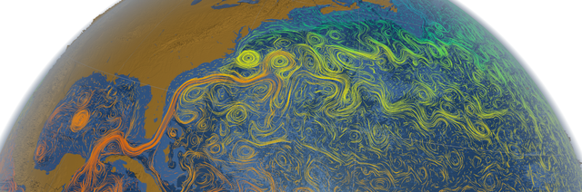
They also made videos that focused on specific areas and added more information. For example, they added layers of color to represent the sea surface temperature of the Gulf Stream so that viewers can watch as the water cools while moving north. The different shades of blue behind the currents represent depth. The darker the blue, the deeper the water. The depth was exagerrated by a factor of 50, but that's because scientific exactitude wasn't the point of the visualization. Mitchell that by darkening the depth his colleague Greg Shirah could really emphasize that the water was moving. “He was looking for something that would be very dramatic,” .
For more, read this interviw with Mitchell on .
—Joe Spring