

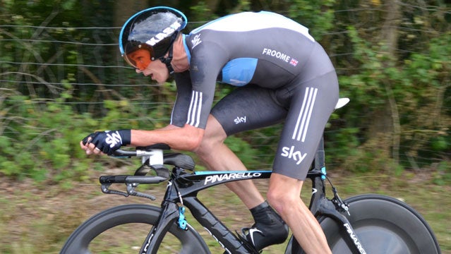
At 23 minutes 14 seconds, Team Sky rider Chris Froome set the all-time 3rd fastest mark up Bonascre AX3 Domaines on Stage 8 of the 2013 Tour de France. His time was fast enough to beat Lance Armstrong’s times in 2003 and 2005, but fell short of Armstrong’s personal record set in 2001.
Team Sky's Problem With Transparency
“Froome’s performance was a thrill to watch, but it also raised eyebrows in the cycling world…On the influential Science of Sport blog, the generally reserved Ross Tucker went so far as to write that Froome is either ‘one exceptional individual, or…well, we know the rest, we have seen this movie too often in the sport.'”��
 DpVAM Analysis
Test Tangent
Test tangent summaryTest Tangent
Test tangent summaryThe day before the climb up AX3, Team Sky Director David Brailsford told “At some point in time, clean performances will surpass the doped performances in the past.” After the stage Froome stated that he is “100 percent” clean and that there’s “absolutely no way I’d be able to get these results if the sport hadn’t changed.”
But should you believe them? While that decision is ultimately up to you, this article looks at objective performance data and analysis methods to help you figure it all out.
The simplest place to start the analysis is with Froome’s time itself. He took 23:14 to cover the 8.9 km distance at an average gradient of 7.46 percent. AX3 has been included in the Tour five times, three times during the doping era (2001, 2003, and 2005) and twice in the “new generation” (2010 and 2013). With this context in mind, we pulled the top 10 times from cycling archivist ‘s AX3 Domaines All-Time Top 100 List:
1. Laiseka 22:57, 2001
2. Armstrong 22:59, 2001
3. Froome 23:14, 2013
4. Ulrich 23:17, 2003
5. Zubeldia 23:19, 2003
6. Ulrich 23:22, 2001
7. Armstrong 23:24, 2003
8. Vinokourov 23:34, 2003
9. Basso 23:36, 2003
10. Armstrong 23:40, 2005
–
22. Porte 24:05, 2013
34. Valverde 24:22, 2013
Aside for Froome’s time, every single performance in the top 10 has come from a rider during cycling’s known doping era. With the 3rd fastest ever, his time beat the top efforts from Jan Ulrich and Ivan Basso, and even beat two of three times for Armstrong. In contrast, the all-time list put Richie Porte and Alejandro Valverde, 2nd and 3rd on the day, just outside of the top 20 and top 30, respectively. The historical analysis of Froome’s time puts his performance into territory dominated by top doping era cyclists and is not reassuring. Porte and Valverde’s times are well off the highest marks and don’t stand out otherwise.
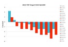
But the record times alone don’t tell the whole story. The next step is to run a DpVAM analysis, a complicated name for a method that allows us to compare results across different climbs and eras for more meaningful results. It’s a simple analysis to interpret. Two bars up for a rider flags the performance as suspicious, while two bars down indicates the performance was at least plausible.
With one quick glance (see the sidebar) you can see why Froome’s performance (the first 2 bars) set off alarm bells across the Internet.
For the analysis, we use equations derived by Scott Richards, who pioneered the method in A Different Approach to Comparing Climbing Performances on . The equations use data from the supposedly clean years of 2008-2013 (pVAM), and at my request, data from the doping years of 2002-2007 (DpVAM), to predict the climbing speeds (VAM) expected from these baselines. The final step is to calculate the difference between the actual VAM measured and the pVAM/DpVAM baselines in percentage terms. The sidebar figure is the final result of the top 10 finishers on AX3.
Looking at the figure again, Froome has two bars up. The bars indicate that he not only went faster than�� the clean predicted climbing speed, or pVAM, by 4.5 percent (blue bar), but that he also went faster than the “doping” climbing speed, or DpVAM, by 1.88 percent as well (red bar). The DpVAM analysis corroborates Froome’s non-reassuring placement on the all-time list behind Armstrong.
(The DpVAM effectively expands the comparison beyond the limited AX3 data set. It confirms that Froome’s performance was equally strong compared to the performances across the variety of climbs included in the baseline data sets.)
In contrast to Froome, all the other 2013 riders were slower than the doping DpVAM baseline (red bars down). Other than Porte, the other riders were also slower than the clean pVAM as well, (blue bars down). For the rest of the peloton then, the doping DpVAM analysis is reassuring. The remaining performances on AX3 were at or below the 2008-2013 baseline and well below the doped 2002-2007 baseline.
The last approach to assess Froome’s performance is to consider the expected limits of human physiology. and @ammattipyoraily have been working on calculating power in watts/kg using various simulators [editors note: power for cyclists can be thought of like horsepower is for cars].
(Pilot data from 20 SRM power files has shown that the simulator available on has produced the best calculated power estimates (r^2=0.893, r=0.94, average error 0.4% and most samples falling within +/-3).)
Using this simulator @ammattipyoraily calculated Froome’s power output at 6.5 w/kg for 21:41 over the 7.85 km climbing portion, and 6.37 w/kg for 23:14 over the full 8.9 km. (The second power figure includes the flat section at the top of the climb which is more wind error affected. A head wind was suspected at the top of the climb based on race video raising the possibility of power underestimates.)
Based on the proposed power curve in Not Normal?, the work of Antoine Vayer, a French journalist and former trainer for the infamous Festina cycling team, 6.37 w/kg for the 23 minute effort puts Froome well into the “miraculous” level of human physiology. This is a level of performance not seen in the Tour de France before the introduction of EPO. It is a level of performance that has all but disappeared following Operation Puerto and the introduction of the Athlete Biological Passport.
At this point, it’s important to stop and acknowledge some limitations. This analysis is based on just one climb. It is the shortest of the critical climbs in this year’s Tour de France and it came in the race’s first week, meaning riders were comparatively well-rested for the effort. The historical times only include two years of “new generation” data, and the DpVAM and Cycling Power Lab models have not yet been truly validated. Each method is derived from climbing times. Factors besides performance that affect time could have skewed the analysis although no such factors were evident in the remaining 2013 rider data.
Also, the analysis will only pick up the effect of doping on top riders. Lesser riders who dope may achieve performances no better than top clean riders. Lastly, the field of cycling performance estimates and monitoring is basically in its infancy. It will likely still evolve significantly.
Overall, the data suggests that the performances on AX3 fell within a range that could be expected for a relatively clean peloton with the exception of Froome. His performance on AX3 is clearly flagged as an outlier and warrants healthy rationale skepticism. Going forward, the progression of his performance should be closely followed over the rest of the Tour.
For more information on cycling performance analysis, I highly recommend reading Ross Tucker’s blog on sportsscientists.com and his post The Power of the Tour de France: Performance analysis groundwork is a good place to start. Also, follow and on Twitter for near real time performance data updates from the Tour de France, and check for pVAM updates from Scott Richards.